Short answer: I rebuilt Ankur Napa Brewing Company (ANBC) as a live, walkable 3D digital twin running on Microsoft Fabric — and the point isn’t the 3D, and it isn’t Fabric. The point is that a brewery is a flow, and a dashboard that’s a flat chart throws that flow away. So I modeled the real plant — mill to mash tun to lauter to kettle to fermenters to bright tanks to the taproom POS — clicked any vessel to see its live profile, and shipped the whole thing in an afternoon with the Rayfin SDK because Fabric handed me the database, auth and hosting for free. The lesson underneath: match the picture to the process, and spend your time on the model, not the plumbing.
Watch it first
Here’s the twin in motion — orbiting the ANBC brewhouse, into the taproom, with live vessel detail and point-of-sale numbers.
Why a flat dashboard was the wrong picture
I’ve spent years on a brewhouse floor, and the thing a normal dashboard never captures is that a brewery is a flow. Hot liquor feeds the mash; the mash runs off to the kettle; cooled wort drops into fermenters; finished beer moves to bright tanks, then kegs, then three taps where it’s actually sold. A grid of KPIs flattens all of that into numbers that have lost their geography. You can see that fermenter 3 is at 18 °C, but you can’t see that it sits two steps downstream of the kettle and one step upstream of the bright tank that feeds the busiest bar.
So the goal wasn’t “make a 3D thing because 3D is cool.” It was: keep the flow. Build the picture that matches how the plant actually works, so the data lands where your intuition already lives.
What’s actually in the twin
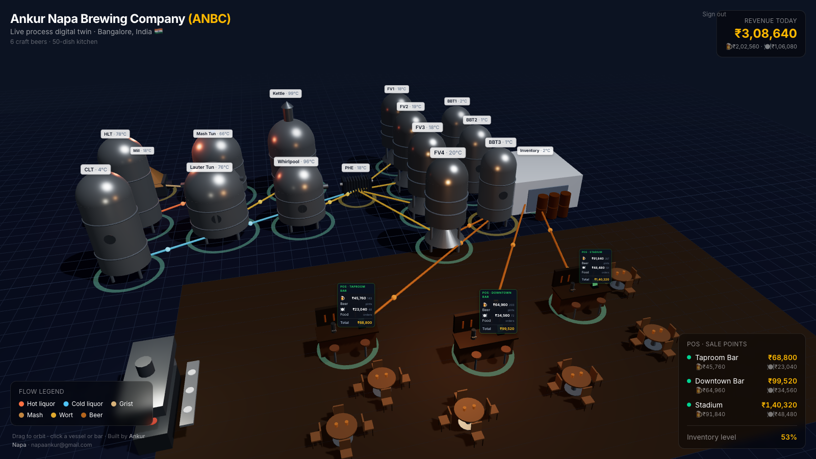
Every vessel in the real process is modeled and clickable:
- Hot side — mill, hot liquor tank (HLT), cold liquor tank (CLT), mash tun, lauter tun, kettle, whirlpool, plate heat exchanger (PHE).
- Cold side — four cylindro-conical fermenters and three bright beer tanks.
- Front of house — packaging and inventory, then a full taproom with three bar stations, POS terminals, tables, chairs and an open kitchen.
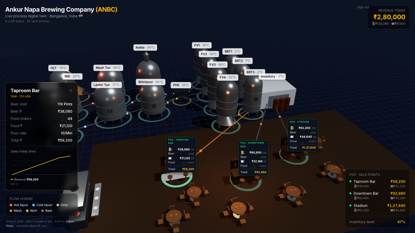
Click a vessel and you get the chart that vessel actually deserves: a mash step-temperature profile for the mash tun, run-off flow for the lauter tun, a falling-gravity and rising-ABV curve for a fermenter, carbonation for a bright tank. Click a bar and you get live point-of-sale — food and beer revenue, per station, in rupees, with a sales trend that ticks up as the simulation runs. Six beers, a fifty-dish kitchen, three sale points, product visibly flowing through the pipes between vessels.
The part that surprised me: Fabric carried the plumbing
This is where it stops being a hobby render and becomes something you’d actually run. Microsoft Fabric is known as an analytics platform, but the new Rayfin SDK adds a code-first application layer on top of it: a managed database, Entra authentication, and static app hosting. A 3D experience built with React and Three.js is, at the end of the day, just static front-end assets — so it builds to a folder, gets packaged, and deploys with a single command:
- scaffold the app, build the 3D front end, and
rayfin up— which builds the assets, packages them, uploads them, and hands back a live URL.
From idea to a live, enterprise-grade URL was an afternoon, not a multi-month BI project — because I didn’t write a line of auth, database or hosting code. That’s the real unlock: the time went into modeling the process and choosing what each vessel should show, which is exactly where the value is. The full first-part build walkthrough is its own post in a short series; this is the why and the what.
If you want the wider context on where AI and analytics genuinely help in a brewery versus where they’re theatre, I’ve written that up in what AI in beer actually looks like in 2026 and the tool-by-tool breakdown in saving water: data analytics vs AI vs generative AI.
Where this breaks
The honest caveats, because a slick video hides them. The demo data is simulated — the telemetry and sales are a random walk so the twin is alive to click through; the architecture has a single data hook that a real Fabric data model replaces with no change to the 3D layer, but today the numbers are placeholders, not your SCADA. 3D is a cost, not free decoration — the Three.js payload is the heavy part of the bundle, and a twin that doesn’t earn its interactivity is just a slow chart; if a bar chart answers the question, ship the bar chart. A model is only as true as its plumbing — a digital twin wired to nothing is a screensaver, and the unglamorous work of metering and tag-mapping every vessel is what turns it from a demo into an instrument. And sign-in is real on the deployed app — Fabric uses Entra SSO, so a public “anyone can watch” link needs deliberate thought about who you actually want inside.
The bottom line
Don’t build a 3D twin because it looks impressive, and don’t reach for Fabric because it’s on the slide. Build the picture that matches how your operation actually flows, so data lands where your intuition already is — for a brewery, that’s grain-to-glass, not a grid of tiles. Then let the platform carry the boring, critical plumbing so your time goes into the model and the meaning, not the infrastructure. The 3D is just how you read it; Fabric is just what holds it up; the real work — and the real value — is modeling the process honestly and wiring it to numbers you trust. Once a brewer, always a brewer: now the dashboards brew on the go.
Frequently asked questions
What is a brewery digital twin? A digital twin is a live 3D replica of a physical operation, wired to real-time data. For a brewery that means every vessel — mill, hot and cold liquor tanks, mash tun, lauter tun, kettle, whirlpool, plate heat exchanger, fermenters and bright beer tanks — plus the taproom and point-of-sale, modeled in 3D and monitored on one screen. Instead of reading a chart about the brewery, you orbit through the brewery and click a tank to see its live numbers.
Can you really host a 3D web app on Microsoft Fabric? Yes. Fabric is best known as an analytics platform, but the new Rayfin SDK adds a code-first app layer with a managed database, authentication and static hosting. A 3D experience built with React and Three.js is just static front-end assets, so it builds to a folder, gets packaged, and deploys to Fabric with one CLI command — inheriting Fabric’s governance and Entra sign-in. It is not the same as Power BI; it is a hosted application that can sit next to your Fabric data.
Do you need months and a big BI team to build this? No. The first working version went from idea to a live, enterprise-grade URL in an afternoon, because the Rayfin SDK ships the database, auth and hosting out of the box. The time goes into the things that actually matter — modeling the process correctly and choosing what each vessel should show — not into wiring up infrastructure.
Is the data in the demo real? In the demo the telemetry and sales are simulated with a gentle random walk so the twin is alive to explore. The important part is the seam: there is a single data hook that the simulation feeds today and a real Fabric data model feeds tomorrow, with no change to the 3D layer. The architecture is real even where the numbers are placeholders.